Search blog:

Entries by Yarnista (327)

Friday
Oct212011

It's comforting.

It's comforting to know that a post I wrote more than two years ago is still 100% true. In September of 2009, I found seven things that I knew for sure.

And I still know them now. But now, they're like for sure for sure. For sure.

Here's what really know, deep down, and have for years now.

1. I was uncool long before being uncool was cool.


2. Pale is the new tan.

null

3. I need constant supervision.

null

4. Cooking and cleaning are for people who haven't discovered knitting yet.

null

5. A morning without coffee is like... something...without something else...

6. Chocolate is proof that God loves me and wants me to be happy.

7. People from Massachusetts do not find it amusing when you yell, "Where'd ya PAHK? Over near HAHVAHD YAHD?"


Just thought you'd like to know.

Wednesday
Oct192011

you are yarnista

That's what my website told me when I logged in today.

It's useful to be reminded who we are once in a while. I know I tend to forget.

Dear Blog,

Who am I? I forget.

Love,
Me

************

Dear Yarnista,

You are Yarnista.

Love,
Your Blog, The Yarnista

************

I'm glad I have these reminders, what with my early onset Alzheimer's disease and my debilitating chocolate addiction.

The air up here is very thin. I sometimes require supplemental oxygen.

Here I am, with my basket of Royal Commemorative Colorways for the royals themselves.

Look, I'm wearing a green coat and yellow shoes. Do you have anything you'd like to say about that?

How about my height? Anything?

I am taller in person than I am online.

Maybe I've mentioned a couple of times that we had some royal visitors to my fair city of the North.

And that I made them some stuff? Mentioned it ever?

On Monday it was time to deliver it.

The Norwegian embassy would not tell us an exact time or location for security purposes. I knew it would be Monday. I just didn't know where or when.

Because I had to be ready at a moment's notice, I combed my hair before leaving for the studio that morning.

It's the least I could do.

The phone rang. I was given a name, a number, and a location, and basically told, "Come in the next five minutes." I didn't have time to change or try to look less homeless.

When we all arrived at the restaurant where we were supposed to meet to deliver the yarn so it could screened by the Norwegian royal advance team, no one was there. I called the cell phone number I was given, and told to go to an alternate location.

(Hello? I have the cell phone number of the Norwegian royal family's social secretary. It's programmed into my phone, just in case I ever need it.)

When we (and by we, I mean anyone at the studio who wanted to come along) arrived at the second location, we found sheets covering the red carpet leading up to the ballroom where the advance team was waiting.

I handed my camera over to Boy Aaron, forgetting that I still had the outdoor sunlight exposure settings dialed in. (Here is one of the disadvantages of a schmancy camera: no auto setting for occasions like this.)

I introduced myself (no, I did not say, "I am Yarnista"), and in the back of my mind, I could hear the shutter of my camera being left open too long. Instead of the sprightly ticktickticktick of multiple exposures being fired in succession, I heard CAAAAA-LICK.  CAAAAAAA-LICK. CAAAAAA-LICK.

If you know what I'm talking about, you already know the outcome of a handheld camera indoors and the sound CAAAAAAA-LICK.

If you don't, here's the result in visual terms:

Blur. Camera shake. It's my fault for not changing the camera settings when we went into the much darker room.

But once we were introduced, I couldn't very well stop and say, "Excuse me, I hear my camera CAAAAAA-LICKing, could you hold just a moment?"

I explained what our gift was and why it was significant. They listened. They asked relevant questions about what kind of yarn it was, wool, silk, alpaca. They touched it.

They said thank you.

They smiled. They assured me they would get it right away, and that they would keep it. I think I might have heard them say that the queen would love it because she loves knitting, but I may have hallucinated that.

We left. I felt happy and relieved.

Happy that I had done what I had set out to do, relieved that it was over. This process was more than a bit nerve wracking, especially for someone who is naturally an introvert like I am. Now I could just sit back and watch from behind the security lines where I belonged.

When the king and queen arrived (she is on the center left, he is in the front left), I noticed right away that she was wearing bright orange. It looks a bit red here, but it wasn't. And she paired it with a pink, purple, and red scarf. "You go," I thought to myself. "You go ahead and rock some bright colors, Ms. European Royalty."

Let us all take a moment to consider the facts.

1. Queen Sonja is lovely, but she is not 19 years old.

2. Queen Sonja is a queen. Queen of a real European country, and her picture is taken frequently.

3. If a grandmotherly monarch can wear vibrant colors, knowing full well her appearance will be catalogued by the press, you can too. Chances are you are not a monarch, European or butterfly, and you very likely do not travel with a press corps.  Which is just all the more reason that you can get away with something other than a sedate, neutral outfit.  If Queen Sonja can do it, so can you.

I was so struck by the color of her jacket and scarf, that I started looking at her pictures from other official functions.  I discovered that she really likes to wear white and cream. But Queen Sonja also has a penchant for color. Here she is in a purple suit with and orange print scarf underneath.

In a cream coat and hat over and orange dress.

Another orange dress.

And here is when I knew deep down that she would like my yarn. That magenta coat.  Oh my.

Deep strawberry fuchsia. Plus emerald jewels. (Oh look, a complementary color palette.)

And just earlier this week at a different function in Minnesota, another orange dress.

Dear Your Royal Highness,

Did I say that correctly? Sources vary on the correct way to address a figurehead monarch.

I am Yarnista.

I hope you will enjoy knitting with my yarn. Given that you like warm, vivid colors, I think you're going to love Hawk Ridge. And Skyline Parkway will be perfect knit into a scarf to wear under your magenta coat.

Thank you for coming to my little corner of the globe.

Most Sincerely,

Huge Dork

Is that how you would sign a letter to the queen, too? I thought so. Maybe tomorrow my website will say "You are Huge Dork" when I sign in.

You can see some more pictures of the royal visit here.

You can read a little blurb about our commemorative edition yarns in our local newspaper here.

You can read a profile of Three Irish Girls from the same day's paper here.

And you can register for this Saturday's studio tour using this info. This is my last public appearance until March of 2012. I'm taking some much-needed time off from traveling, but will no doubt look forward to getting back into the classroom next year. Come say hello while you can! We only give studio tours once a year.

See you Saturday!

And just in case you were wondering, I am Yarnista.

Wednesday
Oct122011

presenting...

When I was trying to decide what to make as a gift for King Harald and Queen Sonja of Norway, I knew the colorways could not be inspired by any of the following things:

1. Meatloaf

2. Football

3. Sauerkraut

4. Sports of any kind

5. Especially football

I finally settled on the places and seasons that make the city of Duluth unique.

I hope they'll like them. If they don't, well, at least I'll be able to hold my head up knowing that my yarn was not inspired by sports or disgusting food.

I started with our current season. (Autumn, in case you were wondering. No, it doesn't snow here 365 days a year. No, we don't travel by dogsled [much].)

We've had a glorious fall. Bright colors, mild temperatures, brilliant blue skies and water.  I wanted to capture that in a colorway.

Hawk Ridge is an overlook in northeast Duluth that hugs the Lake Superior shoreline.

In the fall, tens of thousands of hawks and eagles use this corridor in their migration pattern, leaving Canada and heading for warmer climates. Lake Superior is too large a body of water for them to cross without food, so they instinctively know to stay near shore.

You can read more about Hawk Ridge observatory here.

The view of the lake and the horizon from Hawk Ridge is especially beautiful in the fall, so I used blues and mixed in spruce green, orange, brown, yellow, and red.

I have a confession. I don't really care much for autumn-themed colorways. I don't know why -- maybe they seem a little too cliche, too formulaic, with their analogous color grouping of red, orange, and yellow?

So I had to create something that would make someone like me stop to look, and I'm now totally in love with this one.

I thought long and hard about what made this area special in the winter. Yes, we have snow and cold and frozen water, but visually, it's hard to make an exciting colorway from white, gray, and pale blue.

Then I remembered being twelve. I had a paper route, and had to deliver the paper even on Christmas, even when the temperatures were cold enough to freeze the inside of my nose the second I stepped outside.

The Christmas morning papers are thick and heavy, and we had just gotten fresh snow, so I brought a sled and pulled my bundle of papers behind me.

As I started walking my route in the pre-dawn hours, I noticed how still and quiet everything was -- not a creature was stirring. As if queued by the director of a made-for-TV home-for-the-holidays movie, the sky lit up with an amazing northern lights display.

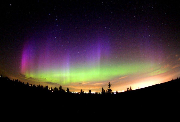
I stopped to watch -- I'd seen the lights from a window before, but only briefly, and my view had always been obscured by neighboring houses and trees.

There was nothing obstructing the sky over Lake Superior that morning, and I still remember the goosebumps I felt knowing that I was probably one of the few people in the world awake and watching the display.

Goosebumps makes for good yarn, methinks.

Skyline Parkway is a 25-mile long scenic byway that traverses the city's highest points and affords amazing views of the lake. You can read more about it here.

In the spring, lilacs grow profusely throughout private yards and public parks. Lilac bushes love the cold winters and sunny days, and grow with abandon.

They seem to especially love the longest freshwater sandbar in the world, a portion of which is seen here.

(Yes, we have a beach here. Yes, the water is cold. Yes, it does warm up enough to swim a little in the summer. Yes, Lake Superior is delightfully salt and shark free. Can you see how shallow the water is on the right side of the picture? It's great for kids.)

We had lilacs in my yard growing up, and I don't recall my parents ever doing anything to them, other than give them an occasional pruning when the branches got too close to the windows. No fertilizing, no watering.

Lilacs know how to bloom where they're planted, a lesson many of us could stand to learn.

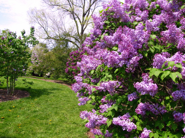
This colorway has several shades of purple and pink for the lilac flowers themselves, married with verdant greens and browns for the woody stems and leaves evident after the flowers have faded.

My mother lives and dies by the phrase Cooler by the Lake.  She hates hot weather so much that she could not consider moving even ten miles further inland, where the summer temps are routinely 5-10 degrees warmer. Except in the winter, where the opposite is true. Lake Superior has a moderating effect on temperature.)

(Yes, the snow melts in the summer. No, we don't have permafrost. Yes, it gets to be in the 80s Fahrenheit, and sometimes even in the 90s. Yes, my mother wrote to her favorite weather man the week before my wedding begging for good news about the temperatures. It was still hot in the church in August, despite her request.)

The centerpiece of Duluth is its harbor and the surrounding neighborhood, Canal Park. Chances are good that if you've eaten grain, driven a car, or used electricity, you've used products shipped out of Duluth on one of these boats.

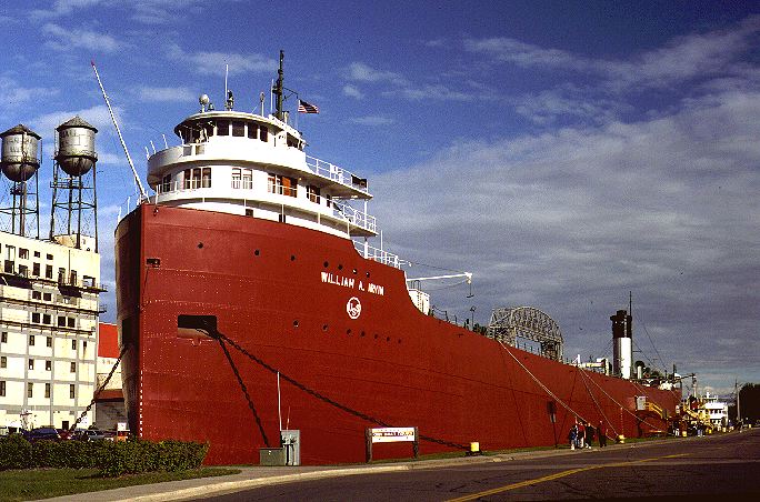
(For the curious, much of the midwest's grain destined for the eastern US or for foreign markets is shipped via railcar to Duluth.)

Perhaps I have mentioned the Aerial Lift Bridge a view times? Perhaps.

It lifts up and down to let the huge boats into the port, where they fill up with cargo and head to the far reaches of the globe. You can see more pictures of the bridge in action in this post.

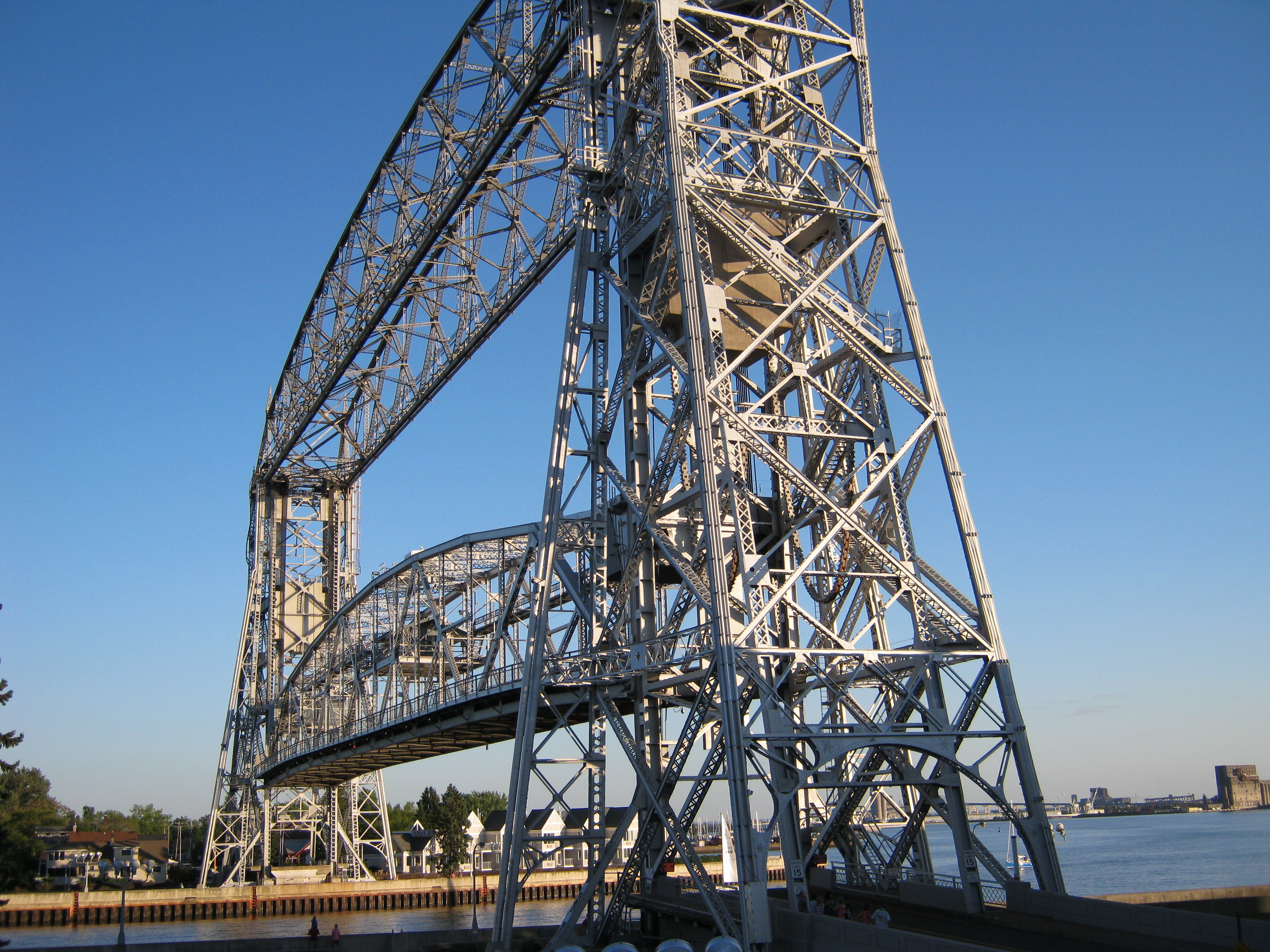
Cooler by the Lake has the grays of our beautiful bridge, the blue of the water, the rust and white of the boats, and the browns of the rocky shore.

And finally, the reason for the Norwegian royal visit in the first place. The rededication of Enger Tower.

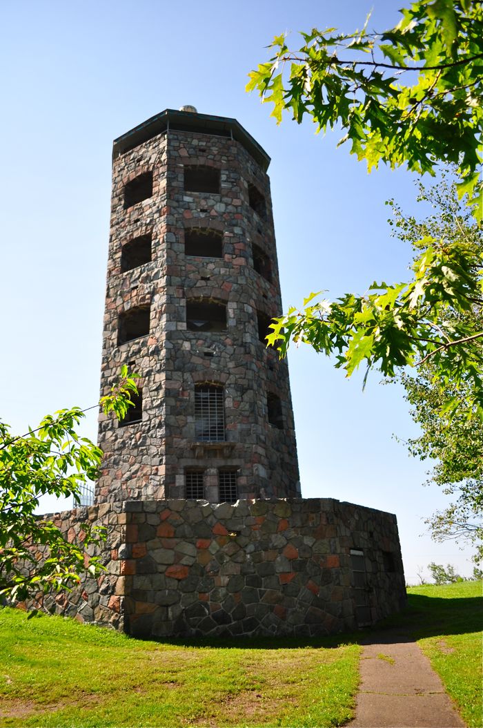
Situated more than 500 feet above Lake Superior on Observation Hill, the tower is a quaint stone structure with a green beacon perched atop it.

The colorway has the grays and reddish browns of the tower, and of course, it wouldn't be complete without a few touches of green.

You can read more about Enger Tower here.

I decided to let y'all in on the fun and make these special colorways available for a short period of time on our site. You can see more pictures and read more about them here.

They'll be up until October 22nd, at which point they'll head back into my vault until the next time Norwegian royalty comes to town.

I'd also love to see you this weekend (October 15th and 16th) at Amazing Threads in Maple Grove, MN. I'm teaching three workshops and will be hosting a trunk show all weekend.

You can read more about the workshops and trunk shows here.

I hope to see you!

Saturday
Oct082011

smelling salts.

Please pass them.

Nine days until King Harald and Queen Sonja of Norway land in my hometown. Nine days.

Oh, look. Here I am with them. They just don't know it.

Nine days until our {temporary} business name change.

The logo is going to look just like that, too. Klassy with a K.

They're going to be in town for the rededication of Enger Tower, which you can read more about here.

Since they're going to be one block from the studio, I am hopeful I'll be able to present them with a special gift I've made.

Maybe you didn't know this, but my specialty is yarn? I dye yarn, did you know that?

So I made them some colorways? Special commemorative colorways? Colorways, question mark?

After a lot of thought and helpful suggestions from friends and Twitter followers, I decided to make something that represented my region. I thought about choosing the colors of Norway (flag, fjords, flowers), but then I realized that they probably have plenty of those colors at home.

If I were traveling to Norway, I wouldn't seek out stuff from the United States or Minnesota. I would want something Norwegian, something I could look at and remember my trip by.

We have a lot of {awesome} Norwegian customers. And we shall soon have a new Norwegian retailer so our {awesome} Norwegian customers can get our yarn locally.

And in the next few days, I'll be releasing commemorative edition colorways that will be available for an extremely limited time.

One will be based on Duluth's glorious autumn, with our blue skies, bright colors, and evergreens.

Another on the amazing auroras we get to witness. Clear skies in winter mean little snow, cold temps, and glimpses of this:

In spring, lilacs carpet the city, mostly unbidden.

And in the summer, Duluthians (and our millions of visitors) flock to Lake Superior for views, a cool breeze, and to watch the action in the harbor.

And of course, no commemorative collection would be complete without a nod to the reason for the royal visit, Enger Tower.

Smelling salts are needed. Smelling salts are needed urgently.

Question: what is the protocol for presenting royalty with gifts? I'm assuming screaming and jumping up and down is out? What would you do, if you were me?

Saturday
Oct012011

not to be a hater, but...(color, demystified)

See part one of this series here.

Please don't take this the wrong way. It's not an indictment of your character, nor does it indicate whether or not I like you as a person.

But I hate football with the blinding passion of one thousand suns. The reasons are many. I will spare you the social commentary.

If you are a person who likes football, more power to you. You go right ahead and enjoy that. Just don't try to get me to partake, because I would rather do any of the following:

1. Stare at the back of my bedroom door.

2. Scrub pots.

3. Dig an 18"x18" hole in the ground and then fill it back in.

4. Assemble 26 entire alphabets from letters I clipped out of magazines.

5. Catalog 10,000 baseball cards.

Sadly for me, Minnesotans love football. My father and spouse love football. And that means I can never completely avoid the eyesore that is the Minnesota Vikings logo.

Fine. I'm being a hater. I can own it. Because of the Vikings (the football team, not the explorers), I have an aversion to the color combination of deep purple and bright yellow.

But I really shouldn't. Used correctly (not on a Vikings jersey), purple and yellow are amazing together.

Purple and yellow are complementary colors, meaning they're opposite each other on the color wheel. Complementary color combinations are very eye catching (hence the use of them in sports logos -- you want to be able to see the jerseys from way back in the nosebleeds). They're dynamic, energetic, and in the case of purple and yellow, a combination of elegant and fun.

Purple and yellow can be difficult to dye on the same skein of yarn. When mixed together in a transparent medium like dyes or watercolor paints, purple and yellow make a really ugly gray-brown. So unless that's your intention, you have to keep these colors from blending. That's part of engineering a colorway. If I want to use purple and yellow together, I need to keep them apart or add additional colors.

Yellow makes purple richer, and purple makes yellow even cheerier. Used alone, purple has a serious, mysterious, noble feel. But in conjunction with a spot of yellow, the mood becomes happier, livelier, and hipper. (Please bear in mind that I'm not making a value judgment about whether purple alone is better than purple and yellow together. These are just tools to help you make decisions for yourself.)

High contrast color combinations are often found in flowers, and some botanists feel this is to make it easier for flowers to be pollinated by birds and insects, and thus a way for them to reproduce.

I want you to especially look at this last example. The petals of this pansy are such a dark purple that they're almost black. Amazing. But what makes the flower -- what helps you see the true shade of the petals -- is that tiny bit of yellow in the center.

By comparison, here is the same picture, except I've Photoshopped out the yellow in the center.

Side by side:

What does this mean for your knitting, your clothing, your home? Here are my rules for using purple and yellow together:

1. A little goes a long way. Choose to focus on either the purple or the yellow, and accent it with the opposite color. Much like fashion magazines tell you to pick a feature to focus on -- your eyes or your lips -- but to walk around with a crazy amount of makeup all of your face can be a bit...let's go with...garish.

2. Use colors of varying saturations (or intensities). If you use a lot of dark purple and a lot of bright yellow, you're going to end up with a Minnesota Vikings sweater. Try pairing intense purple with a buttercream yellow. Or mimosa yellow with a lighter magenta. The brighter the accent color, the less you need to use of it.

3. Use clear hues with dirty ones. A clear hue is one in which little to no black (or brown) is added. On this color wheel, the colors on the outside of the wheel have more gray and brown added -- they're dirty. The colors in the middle have more white added, and the clearest colors on this wheel are on the 5th ring in from the edge.

Choose a bright lemon yellow and a red-violet with a bit of brown added. Or a smoky lavender with a spring yellow-green.

Here are some other palette ideas for you:


Source: etsy.com via Yarnista on Pinterest


Does using purple and yellow together mean that you need to go home and paint your living room magenta and get yellow drapes? Of course not. Use them in measured doses based on your preferences. I love the way the bright shades work with the gray sofa here:


And how they pair with brown here:


Here are some knitting ideas for you, too:

Eilis:

Elowen + Cian

Brady + Burke

I would love to see a sweater knit from a deep purple, like Enna:

With just one hint of bright yellow, like the edging on a button band.

To give you some further inspiration, I've created a Pinterest board dedicated to purple and yellow. You don't need a Pinterest account to see it, so click here to view. If you'd like an invitation to join, use the contact button in the upper right, include your email address, and I'll send one over.

Feel free to leave questions and comments on the items I've pinned (or here on the blog), and I'll be sure to answer.

So, to recap:

1. Football is the axis of evil.

2. Small amounts of a complementary color richen any palette.

3. Don't feel that you need to surround yourself entirely in complementary colors. Adding pops of purple and yellow to neutrals gives a similar effect without the Minnesota Vikings references.

4. Life is too short to knit with beige yarn.

Perhaps I drank too much Hatorade this morning, and need to back off on the Vikings. So long as you follow the purple and yellow rules, and don't try to knit yourself a jersey, I'll be happy.

Related Posts Plugin for WordPress, Blogger...